Maria Lains
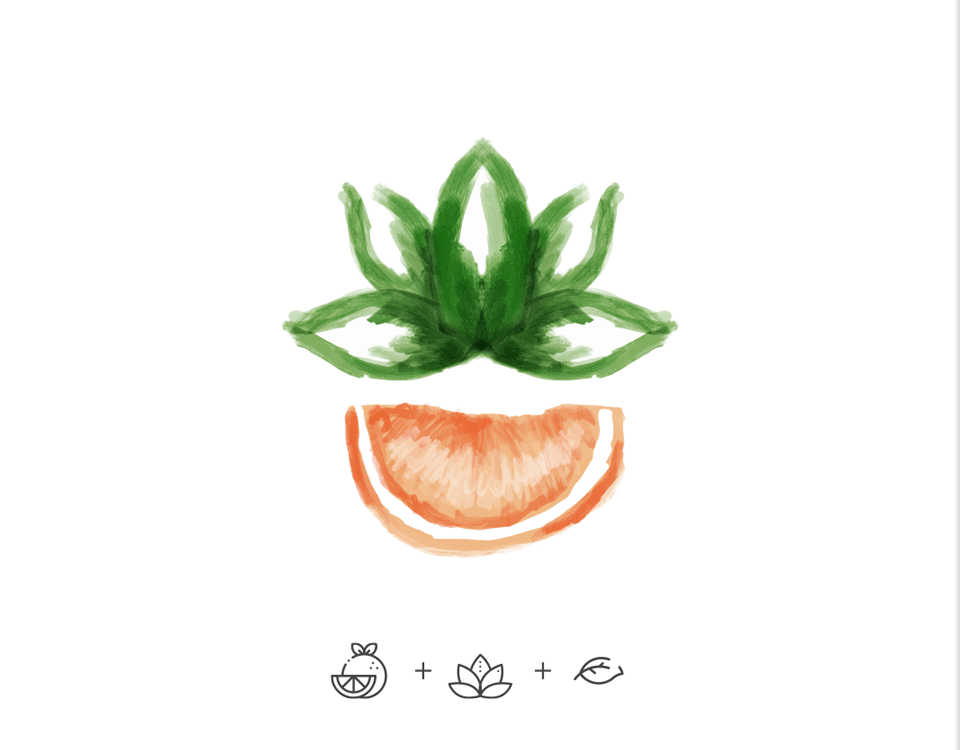
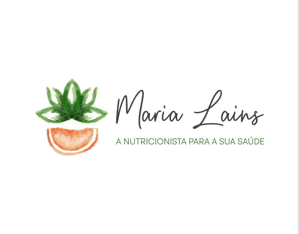
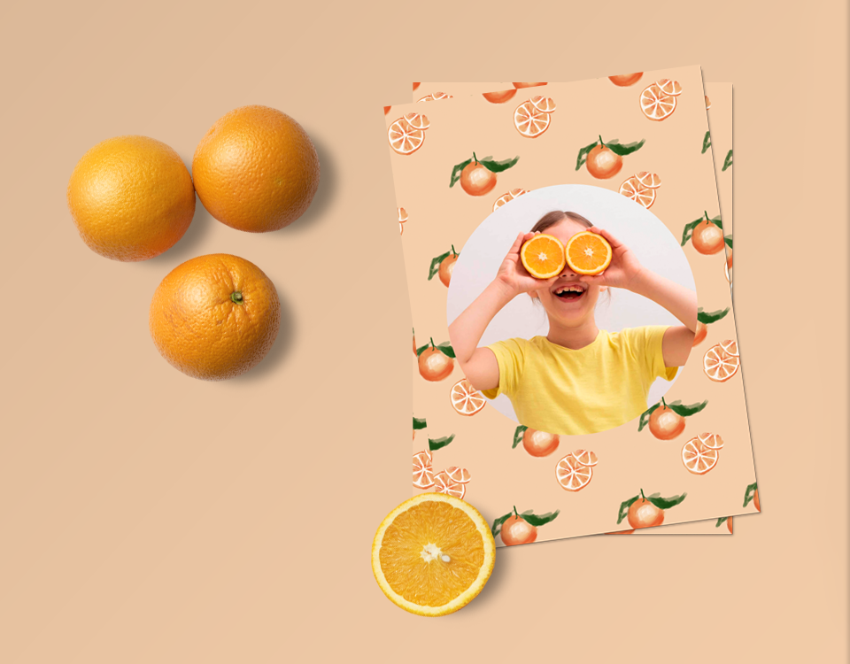
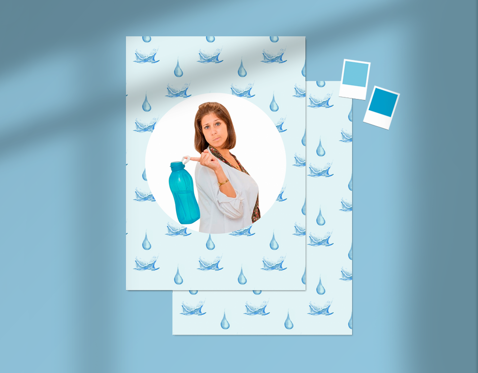
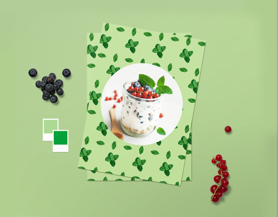
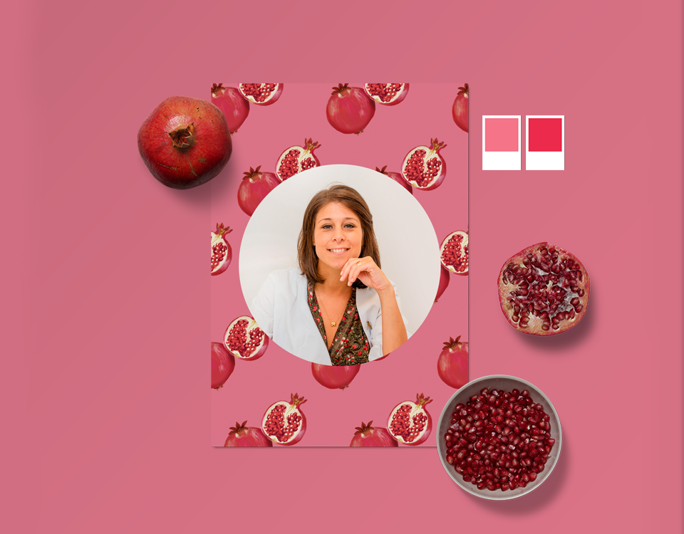
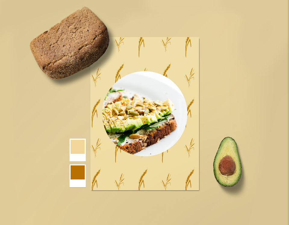
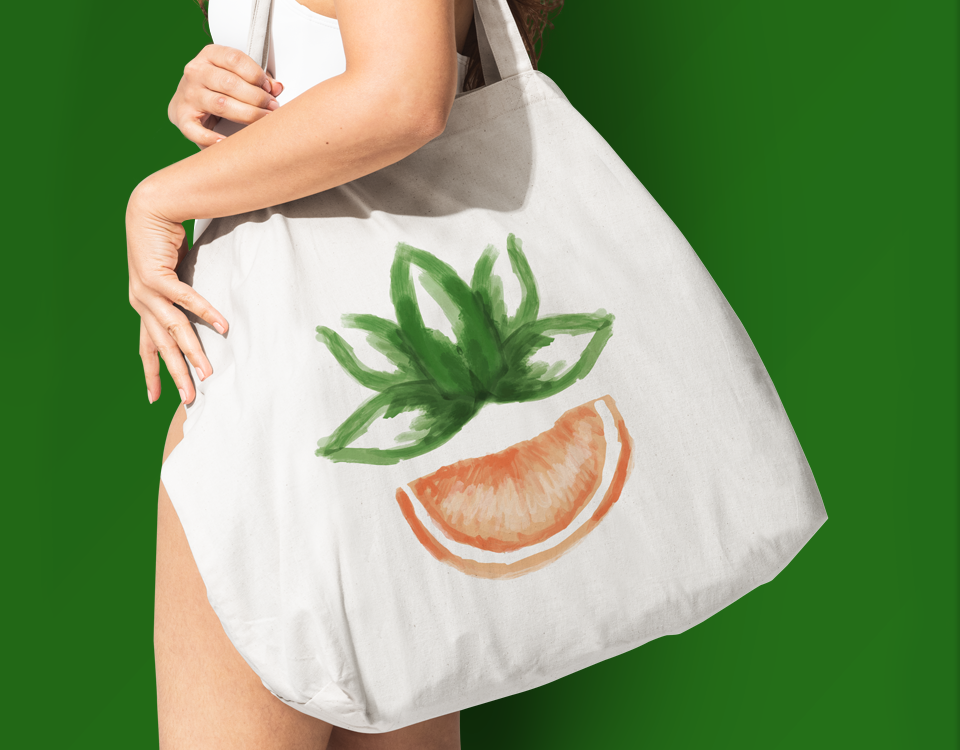
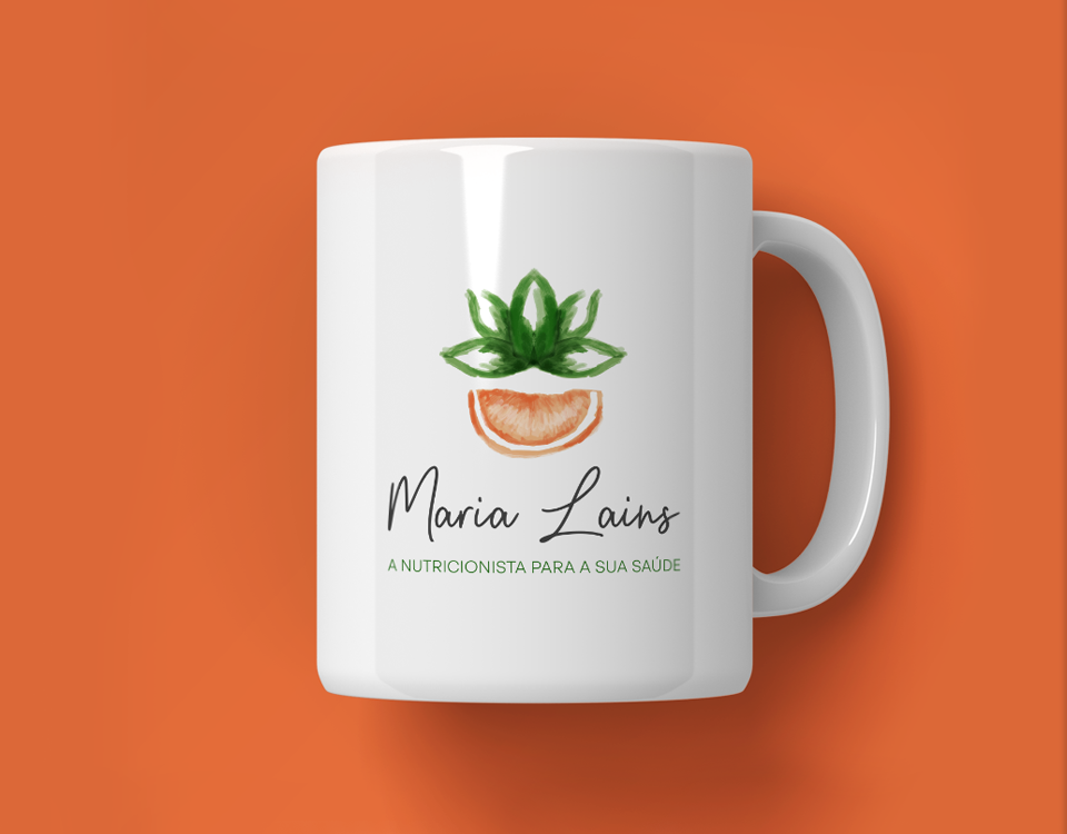
Maria Lains is a licensed nutritionist who needed her personal brand to convey the values she stands for: Posivity, Vitality and Fullness. She says that most of her patients go through a journey of transformation, on their own initiative, trying to change habits towards a healthier lifestyle. She helps them ont only from a nutrition point of view but in an all-around guidance. In this inner process that includes mindset and health, yoga and meditation are activities that Maria practices and encourages. Those habits also play an important role on the brand identity. Identifying the pain points that patients go through on their nutrition and health journey, we tried to escape the ideas of restriction, struggle, fear and punishment. When thinking about what Maria’s clients should feel, we focused on well-being, positive vibes, health and happiness. Using the orange as the logo’s main element, as Maria requested, we created a lotus flower from orange leaf illustrations to include the yoga, meditation and mindset concepts. We also crafted a series of other original illustrations, with food and nutrition elements, to depict the brand’s main concepts. The patterns created with orange, pomegranate, mint, wheat and water illustrations, together with a consequent secondary color palette, reinforce the identity in a colorful and joyful way. The chosen typography reinforces this as a personal brand, with the hand-lettering typeface strenghtening Maria’s personal stamp.
- PROJECT Maria Lains
- SCOPE Brand Identity
- CREATIVE DIRECTION my own design studio
- DESIGNER Bernardo Covas
- ILLUSTRATOR Marta Castelão
- CLIENT FEEDBACK “Before the project I can clearly say that my brand was in a very early stage. I had no logo or identity, nothing to reflect myself and what I stand for. Now I work, market and present my services with a lot more confidence, knowing that my brand speaks for itself just the way I wanted! I’m showing up in a more professional way. My message is sent to the public with a lot more credibility.”


