TWONIC
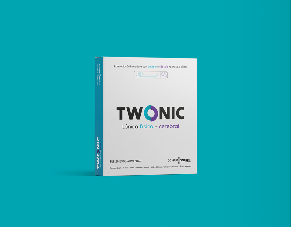
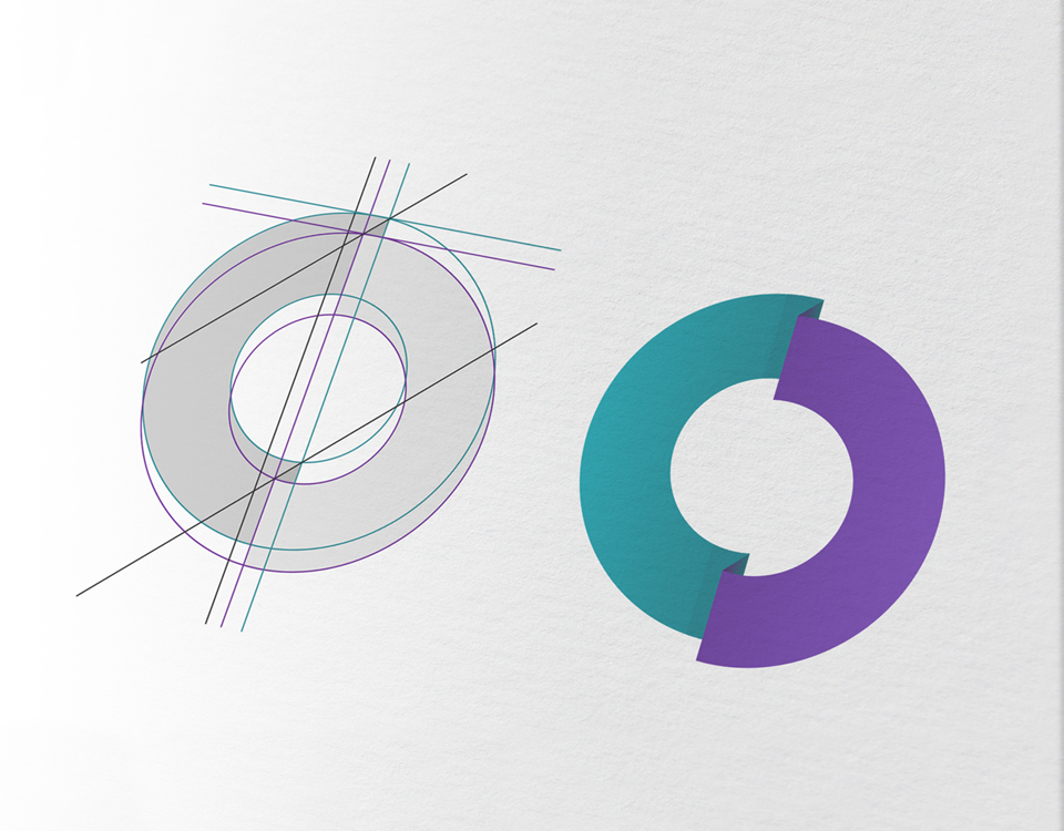
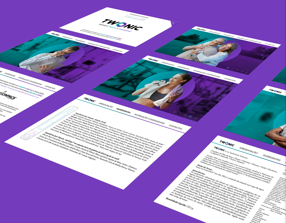
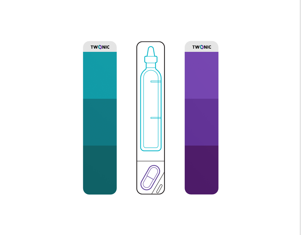
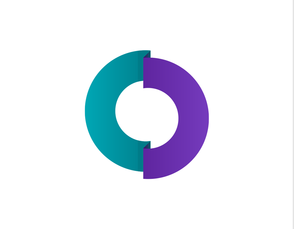
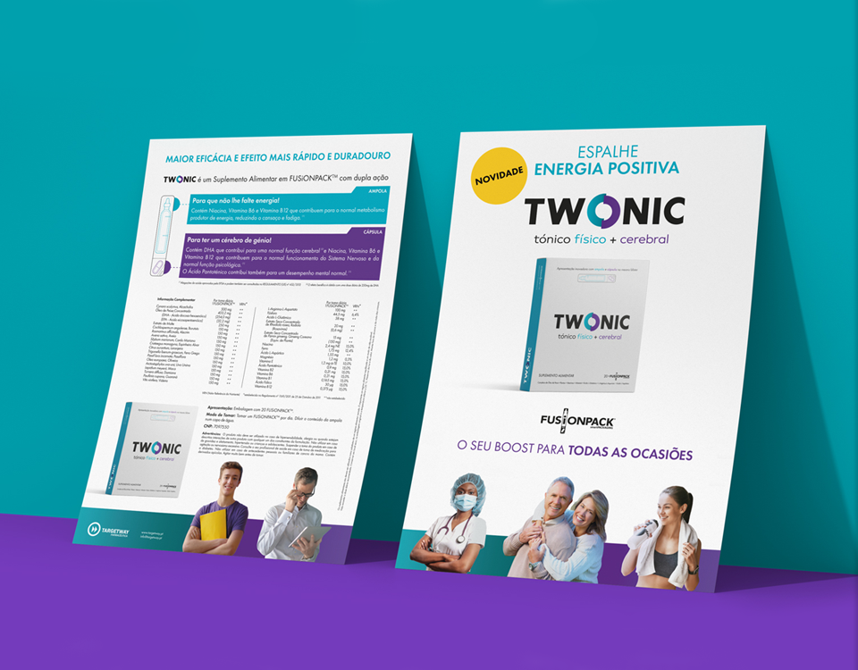
TWONIC is a physical + brain tonic with an innovative differential, tailored to fit the user’s needs. With an ampoule (physical tonic) and a capsule (brain tonic) in the same blister, enabling both options between taking them together for a double action or separately in different timings. The disruptive presentation allows TWONIC to fit a wide target audience. From the elderly to young adults with diverse lifestyles and careers. From students preparing for an exam to healthcare professionals starting a new shift. From a physical boost after a gym session to the mental stamina needed to complete demanding professional tasks. The brand name joins the words TWO and TONIC, creating TWONIC. The logo highlights a round mark replacing the letter “O”. It symbolizes the 2 in 1 concept. Each half represents both the physical and the brain tonic effects. The color palette is another essential layer in this depiction, due to the meaning and subconscious effect of each color.
- PROJECT TWONIC
- SCOPE Naming, Brand Identity, Web/Digital
- CREATIVE DIRECTION my own design studio
- DESIGNER Bernardo Covas
- CLIENT FEEDBACK “We asked our employers and family members to come up with names for the product. We had a whole wall filled with ideas and a few favorites. When we reached out for help, yet without a final brand name, we realized most of our options already existed – exactly alike or similar – and couldn’t be registered or used. Your research and analysis made things clear and with only a couple of proposed options, you guys nailed it! Plus, you did it aligning the name and the brand identity with the whole purpose and differential of the product, accomplishing every goal we talked about.”


