SUNFLOWER
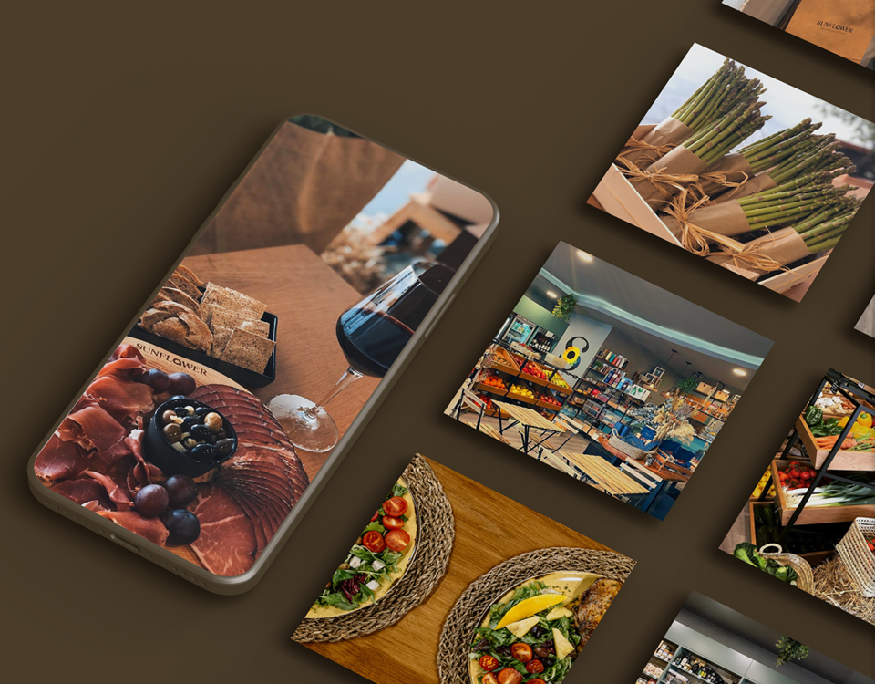
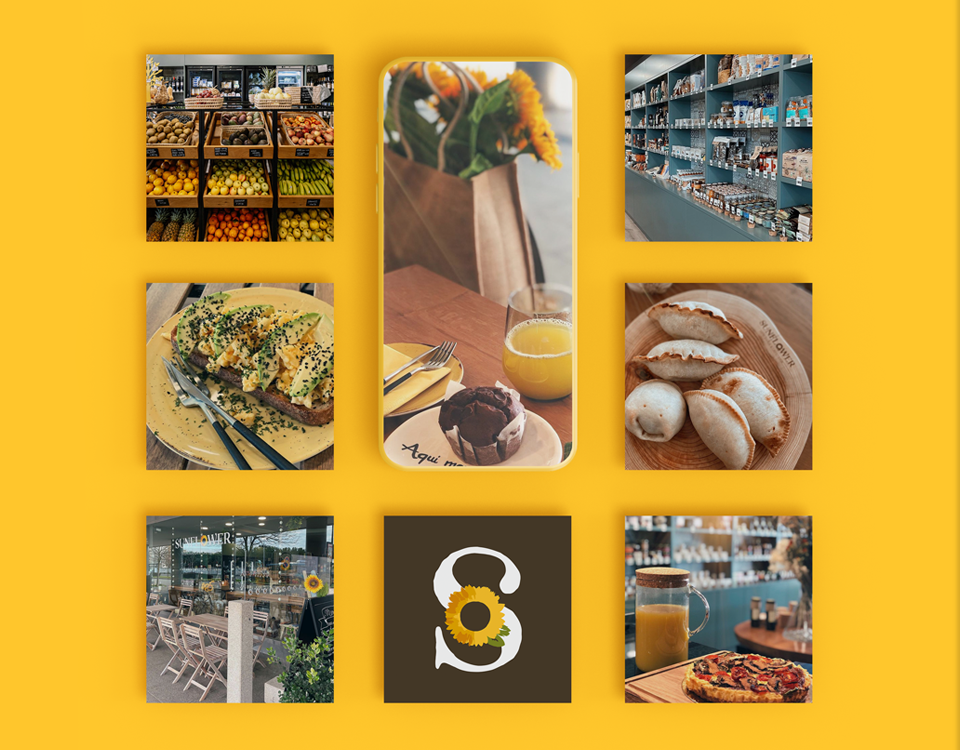
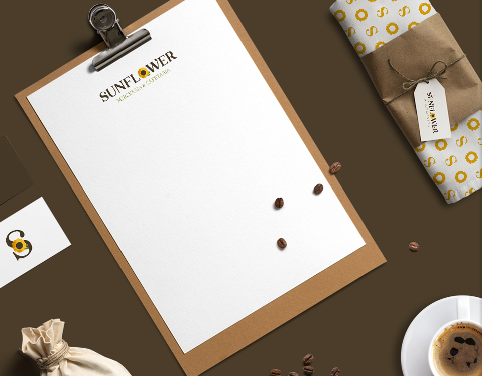
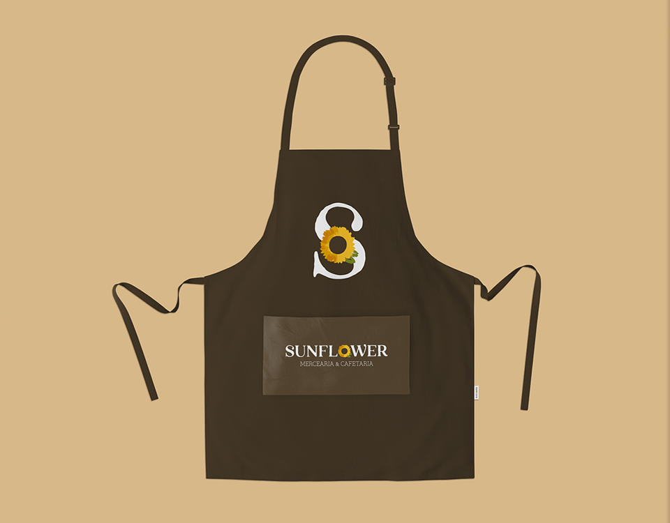
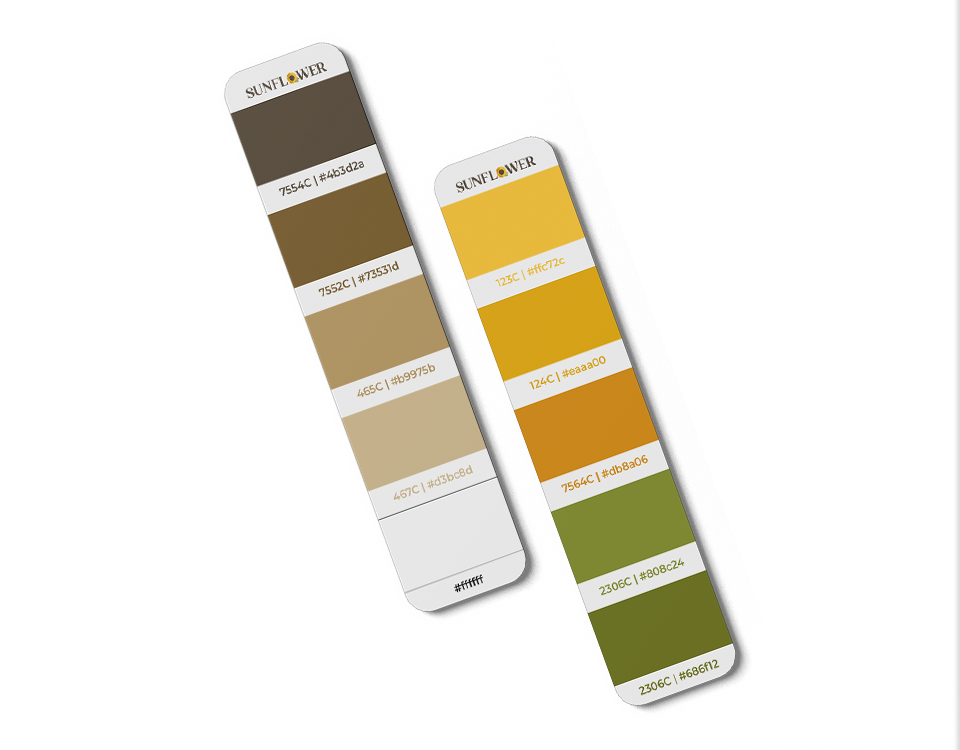
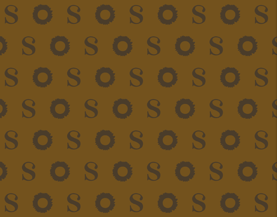
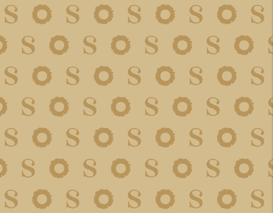
SUNFLOWER is a grocery store &cafeteria in Porto, Portugal, selling quality, biologic and gourmet food. We crafted a brand with an organic and natural vibe, a happy personality and a rustic look and feel. The logo merges an illustration-like sunflower mark with the brand’s name. Simulating paint-brush strokes, the sunflower is designed to underline the brand’s positioning and personality. The secondary version, joining only the initial letter “S” with the sunflower mark, allows for a versatile and totally responsive logo. The main identity elements helping the brand highlight its character are the typeface, the colors and the patterns. The imperfect serif typeface merges the rustic concept with the gourmet and quality features. The earthy and natural color palette reinforces the brand’s character. The custom patterns open new possibilities for a consistent on-brand marketing and communication.
- PROJECT SUNFLOWER
- SCOPE Brand Identity
- CREATIVE DIRECTION my own design studio
- DESIGNER Bernardo Covas
- CLIENT FEEDBACK “I had an idea in my mind, sketch it up, but gave them the freedom to either move in that direction or make a different decision. I’m happy they choose a different path because this whole identity it’s much more straight forward and applicable. The brand shows exactly what our business is about.”


