tna
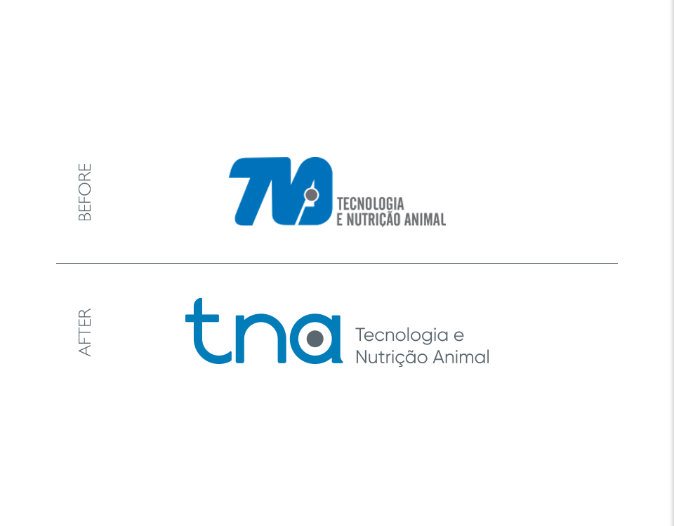
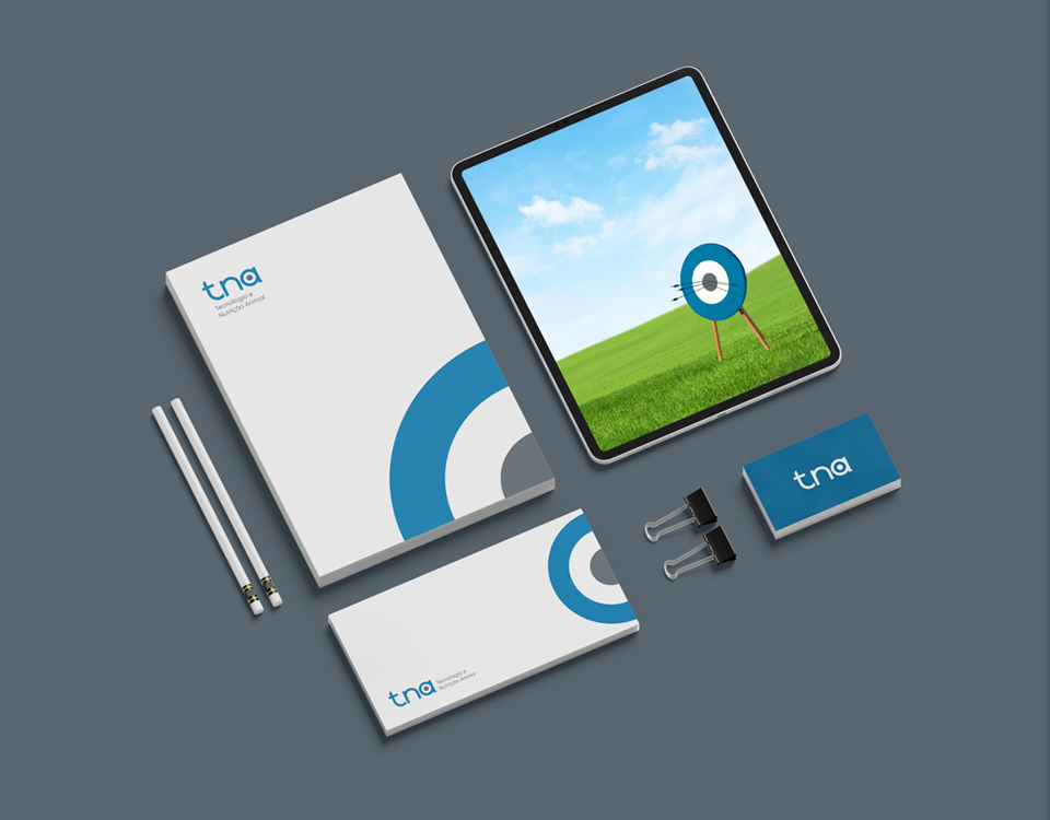
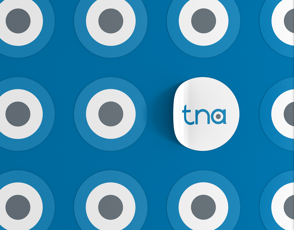
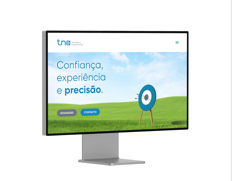
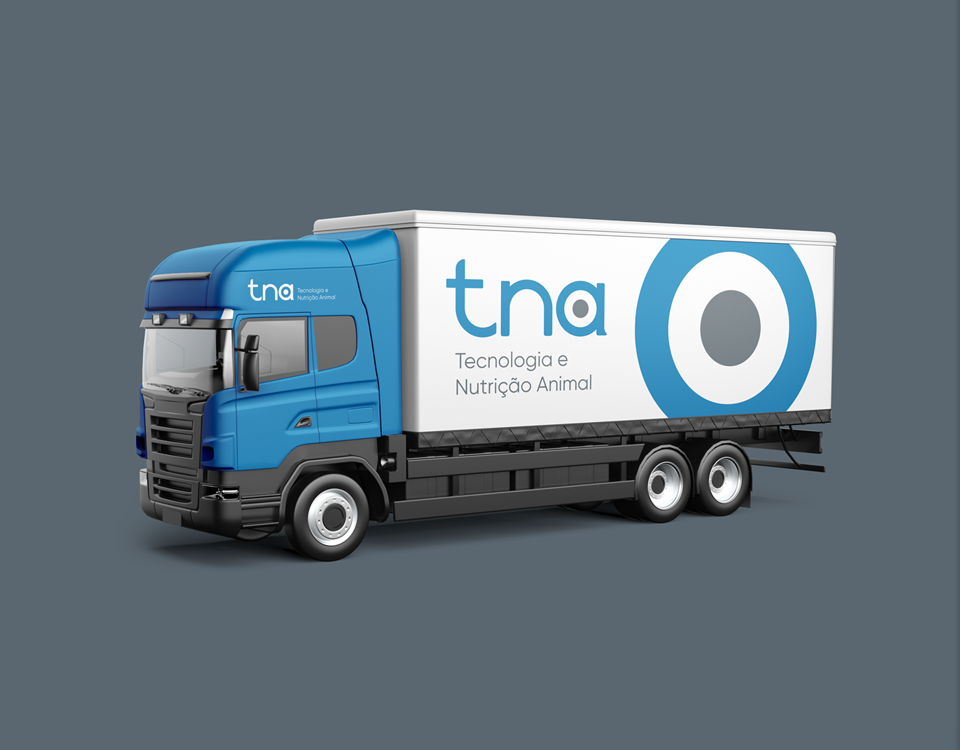
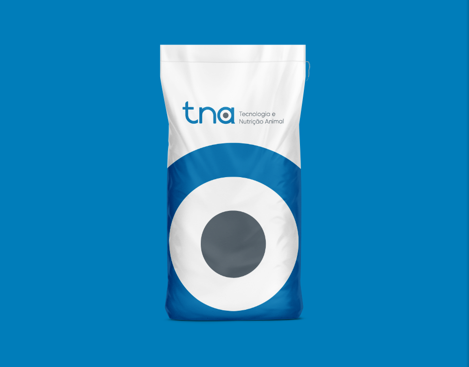
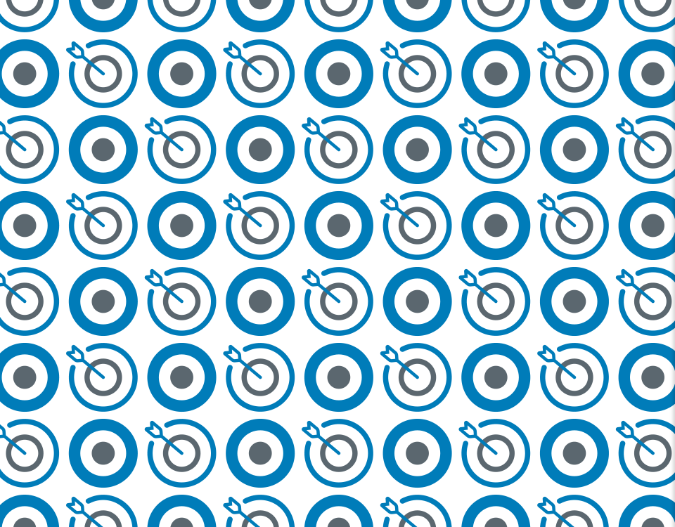
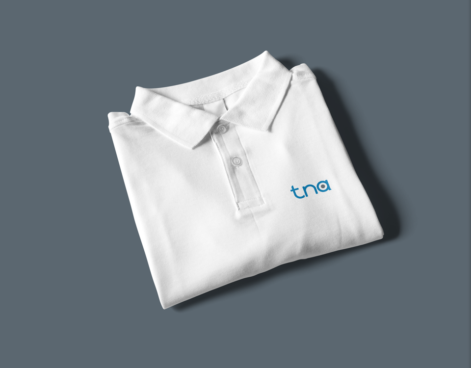
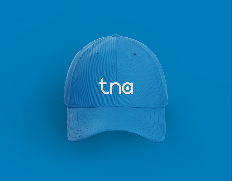
A company with 30 years in the animal feed industry, entering a new stage. Until now, the company was exclusively part of the production chain of its shareholders, that use tna’s products to complete their own compound feed for animals. With new management, an increased production capacity and expanded horizons, tna was now ready to market their products and services to outside companies. From their previous logo (the only element the company had, instead of the brand identity system they needed for this new stage), the client only asked to keep the same colors to smooth the transition. The main goal was for tna to be perceived as an experienced, trustworthy company, producing efficient and precise solutions. The new logo showcases a bespoke tna lettermark, reinventing the grey circle as the center of the target that represents the efficiency and precision of tna’s products. The target can also stand on its own as an extra element of tna’s identity. The new brand identity keeps the main colors, with redefined and optimized blue and grey. Other elements such as icons and imagery help tna to stay consistently on-brand in every touchpoint, whether it’s their online presence, the product’s packaging, the company’s uniforms, vehicles or marketing materials.
- PROJECT tna
- SCOPE Brand Identity
- CREATIVE DIRECTION my own design studio
- DESIGNER Bernardo Covas
- CLIENT FEEDBACK “It’s a whole other level. We can now present our company with a clear vision and matching visuals. We had a generic logo, with no special meaning behind it, and nothing else. Now we’re able to use different elements to communicate consistently. Our marketing, packaging and overall communication will be as effective as our products!”


