PRO FARM
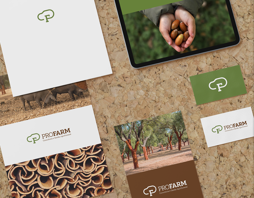
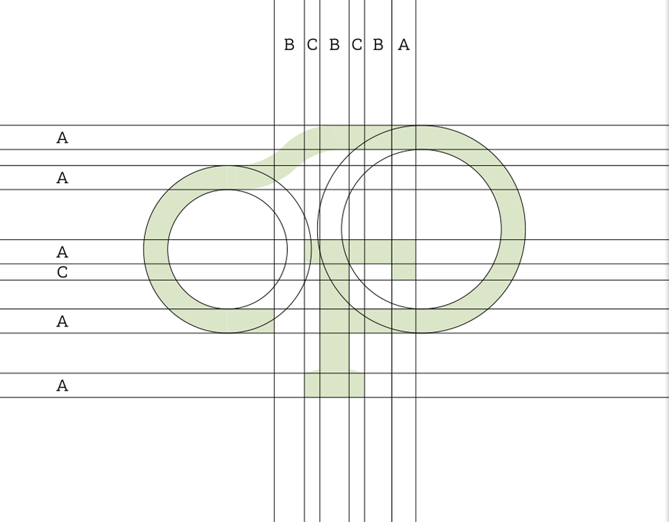
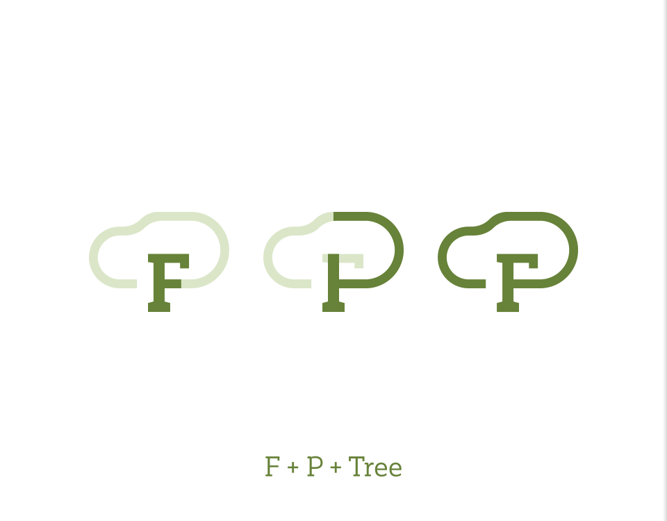
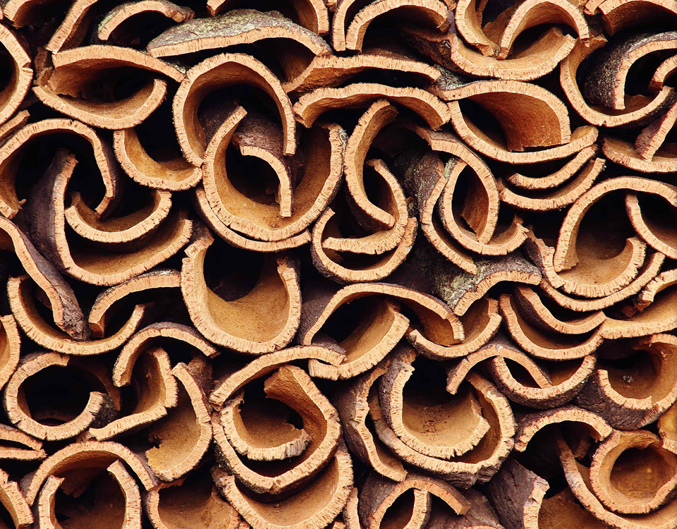
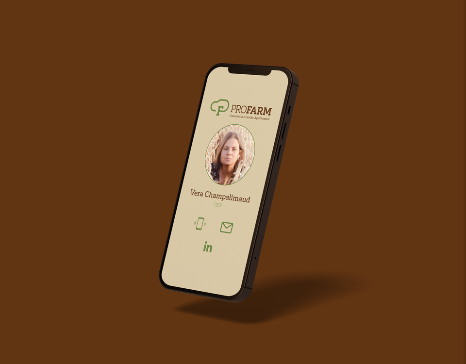
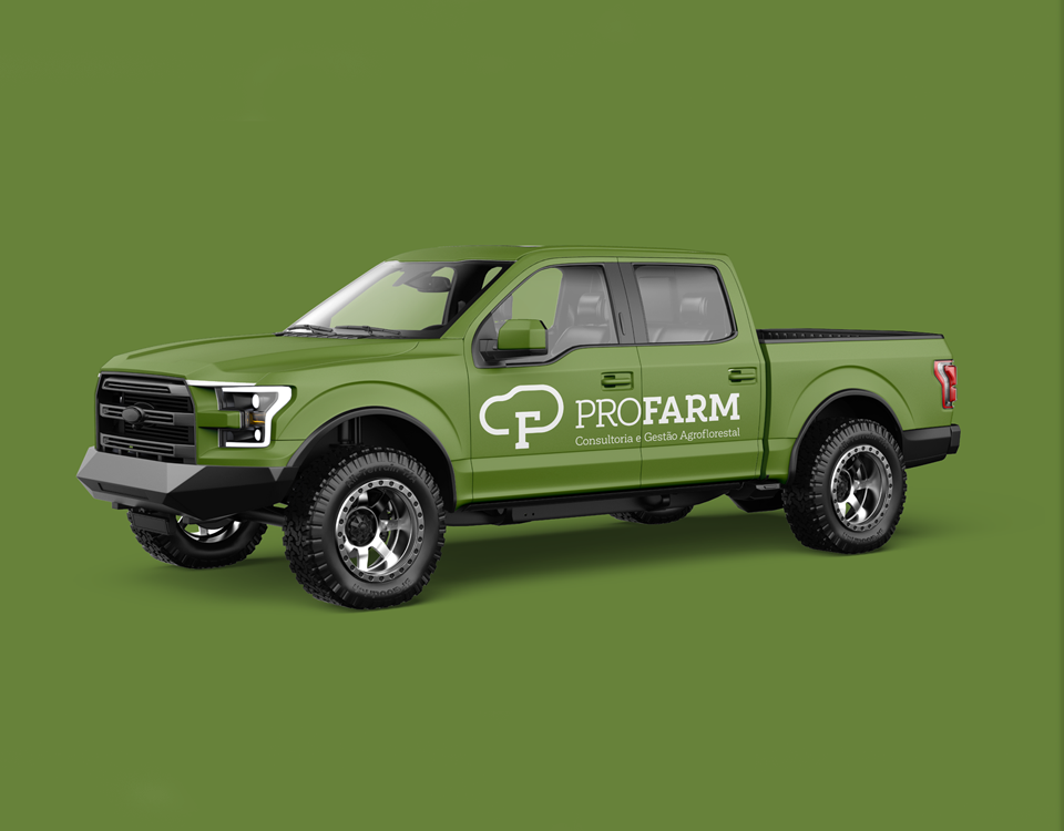
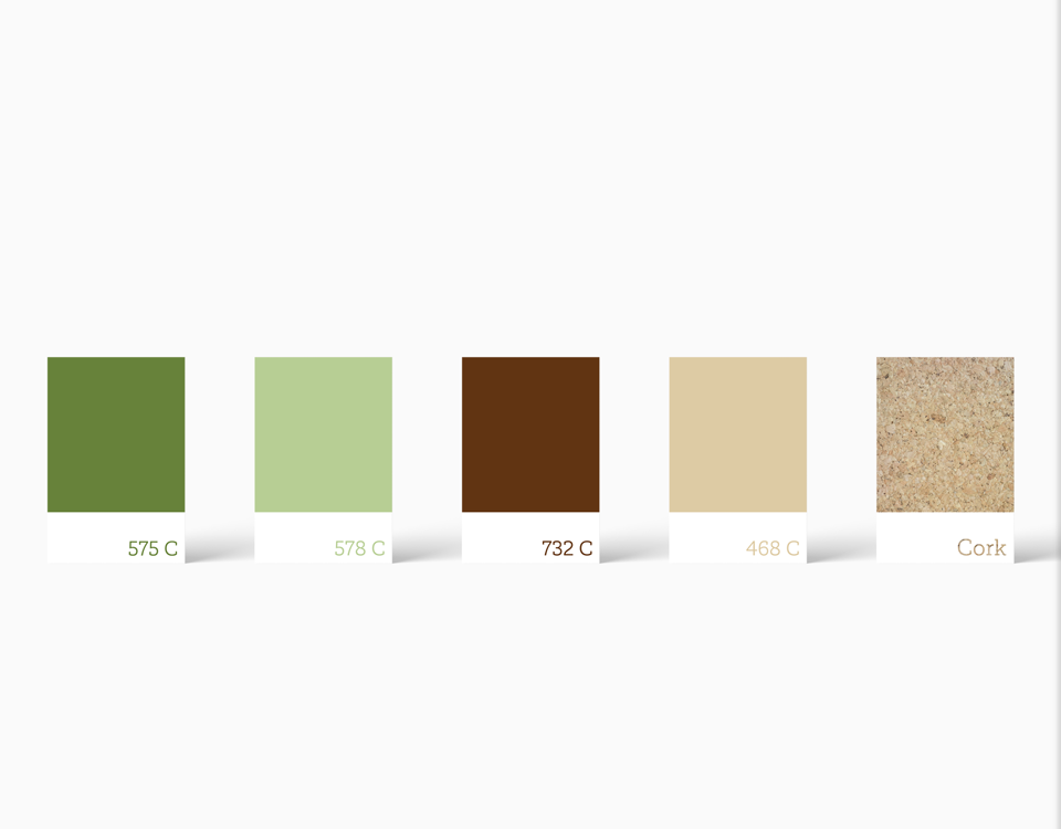
PRO FARM is a Portuguese agroforestry consultancy and management company that helps rural landowners to manage their properties. Their goal is to maximize the property’s profitability while preserving the environment and allowing the landowner to stay hand-off of the management process. The logo’s main element is a tree, alluding to the company’s expertise. The brand’s initials, P and F, are included within the tree mark. The brand colors relate to nature and aim at a rural, yet professional identity. In addition to the color palette, we introduced another element: the cork texture. It suits the brand because Portugal is the World’s biggest cork producer and cork tree properties are one of the main PRO FARM’s ideal clients.
- PROJECT PRO FARM
- SCOPE Naming, Brand Identity
- CREATIVE DIRECTION my own design studio
- DESIGNER Bernardo Covas
- CLIENT FEEDBACK +


